The IQNOX Rich Text Editor is a powerful and flexible ThingWorx widget designed to enhance text input and formatting capabilities within your applications. Built on a robust rich-text editing framework, this widget enables users to create, edit, and format content effortlessly with a user-friendly interface. It supports a wide range of text styling options, including bold, italics, lists, headings, and more, making it ideal for capturing detailed notes, descriptions, and other structured text content in ThingWorx mashups. Seamlessly integrated and highly configurable, the IQNOX Rich Text Editor improves usability and productivity while maintaining a lightweight and efficient performance profile.
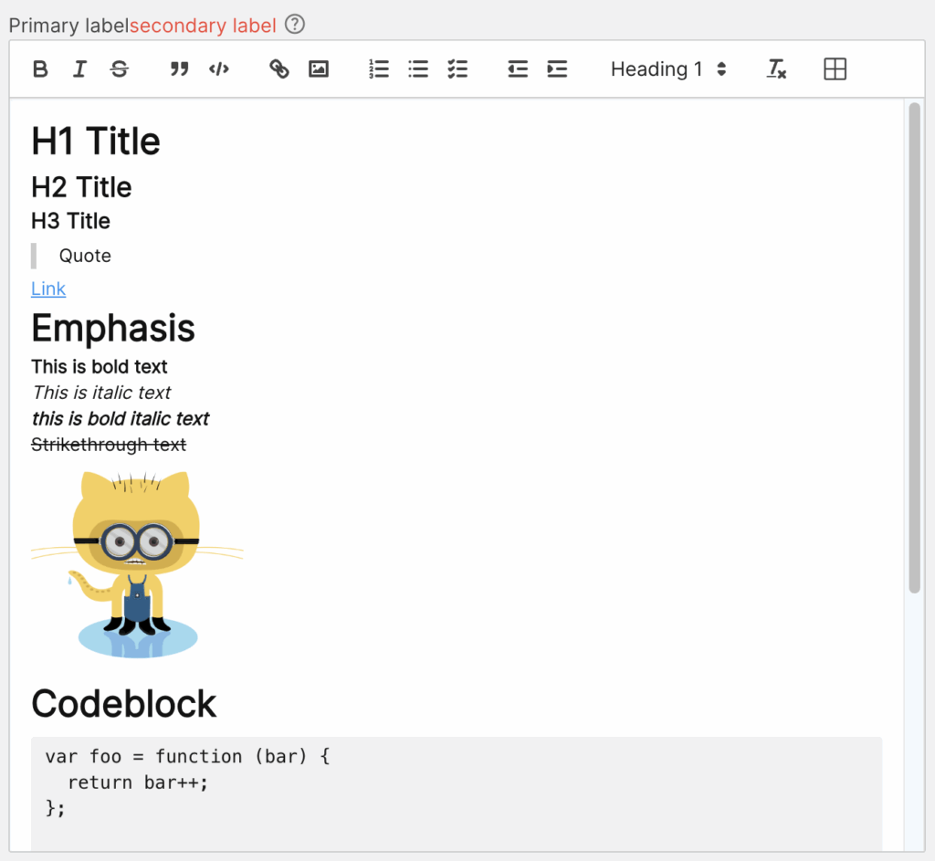
Examples
Properties #
| Property | Type | Binding | Default value | |
|---|---|---|---|---|
| CustomClass | STRING | <> | Enables you to define an HTML class to the top div of the widget. Multiple classes can be separated by a space. | |
| HTMLText | STRING | <> | It outputs the content of the widget as HTML | |
| MarkdownText | STRING | <> | It outputs the content of the widget as Markdown | |
| AllowedIframeSources | STRING | < | www.youtube.com, player.vimeo.com | Comma separated list of iframe source domains that are allowed to be embedded as video elements in the editor. |
| VideoEmbedSettings | JSON | |||
| DebounceTime1 | INTEGER | 300 | Time in milliseconds from last key pressed to triggering the ContentChanged event. | |
| Label | STRING(localized) | < | The text that is displayed above the Rich Text Editor | |
| ShowSecondaryLabel | BOOLEAN | < | Flag property which decides whether or not to show the Secondary Label. | |
| SecondaryLabel | STRING(localized) | < | Type of the input that will be passed to the widget. | |
| ShowHelpIcon | BOOLEAN | < | FALSE | Will enable a customizable icon on the right of the label, the icon will show the tooltip on hover for more documentation |
| HelpIcon | STRING | < | material-outlined:help | Icon to be displayed on the right of the label when ShowHelpIcon is enabled. |
| Tooltip | STRING(localized) | < | Optional tooltip used to display additional information. If ShowHelpIcon is enabled, the tooltip will be triggered by hovering the HelpIcon. This tooltip can be styled globally from GlobalStyles. | |
| TooltipFormat | STRING(localized) | < | see Format Complex | |
| Mentions | INFOTABLE | < | The list of mentions that will be available in the editor. | |
| MentionsDenotationChars | STRING | Specifies which characters will cause the mention autocomplete to open. Must be a single character. An empty string will disable the mention feature(ex @). | ||
| MentionDenotationCharFieldName | LIST | The column from the Mentions with the character that will be used to denote the mention. Leaving it empty means that the mention will trigger for all characters. | ||
| MentionDisplayFieldName | LIST | The column from the Mentions with the display of the object. | ||
| MentionIdFieldName | LIST | The column from the Mentions with the id of the object. | ||
| Placeholder | STRING(localized) | < | Text that appears in the text box when it has no value set. | |
| ReadOnly | BOOLEAN | < | FALSE | Disables any interaction with the widget. |
| TabSequence | INTEGER | 0 | Specifies the tab order of an element (when the “tab” button is used for navigating). | |
| Template | LIST | < | The widget template to use for this widget. | |
| ToolbarBehavior | LIST | How the toolbar should behave. Either Fixed, Floating or Hidden. | ||
| ToolbarOptions | LIST | The options that are available in the toolbar. For example, if just markup is needed, you can set this to “Basic”. Available options: Full, Basic, Minimal, Custom. | ||
| ToolbarControls | JSON | < | A JSON that defines which toolbar controls to display and how. Available only when ToolbarOptions is set to Custom. See more options: https://quilljs.com/docs/modules/toolbar#container |
Services #
| Property | Type | Binding | Description |
|---|---|---|---|
| Blur | SERVICE | < | Removes the focus from the element |
| Focus | SERVICE | < | Forces the focus on the widget, allowing it to receive keyboard inputs |
Events #
| Property | Type | Binding | Description |
|---|---|---|---|
| ContentChanged | EVENT | > | Triggers an event when the value of the widget is changed |
Videos #
Because video elements cannot be rendered natively in Markdown, they are exported as HTML.
Two types of elements are treated as videos:
1. HTML <video> elements
Any URL that ends with .mp4 or .webm is automatically embedded as an HTML <video> element.
Users can also provide raw video HTML in the input element. This HTML is transformed according to the video settings defined in the VideoEmbedSettings JSON property.
Supported attributes
- height
- width
- poster
- preload
- crossorigin
- controls
- muted
- autoplay
- playsinline
- loop
2. HTML <iframe> elements
Users may also provide an HTML <iframe> in the video input element.
Iframes are rendered in the editor only if its src is whitelisted in the AllowedIframeSources widget property. If the src value is not whitelisted, it is replaced with //:0.
Supported attributes
- height
- width
- sandbox
- title
- referrerpolicy
- allowfullscreen
- frameborder
- allow
Video Elements configuration
The HTML attributes that should be added to embedded elements in the rich text editor are defined in the VideoEmbedSettings property.
VideoEmbedSettings supports two configuration objects:
- iframe
- video
Shared attributes such as width and height can also be defined at the top level of the JSON object. These values apply to both element types.
The default value is
JavaScript{ iframe: { frameborder: 0, allowfullscreen: true, }, video: { controls: true, } }
Notes #
1. DebounceTime is only available if TriggerContentChanged is TRUE, else ContentChanged is trigger on defocus/enter key pressed. ↩︎
 IQNOX
IQNOX